

According to a source, 70% of the Internet contents is now being viewed with mobile phones. This means that the net’s visual content is silhouetted mostly from a screen of a size of a C cassette (6 x 10cm). What a waste! What a pity!
Cover art, whether an illustration or a photograph, has a strong commercial function: to promote the sales of the product in question. But it can also be argued that covers have a pure aesthetic function, and that the image may be purely artistically connected to the product.
To fully appreciate the art of the covers, the “canvas” needs to be large enough. Look at old paper magazines. Look at LPs. Twelve inches by twelve inches. As if created for making art.
Album art is cover art at its best, and LP covers are the king of the hill, ever since Alex Steinweiss, an art director and graphic designer, brought custom artwork to record album covers and invented the first packaging for long-playing records.
The exhibition
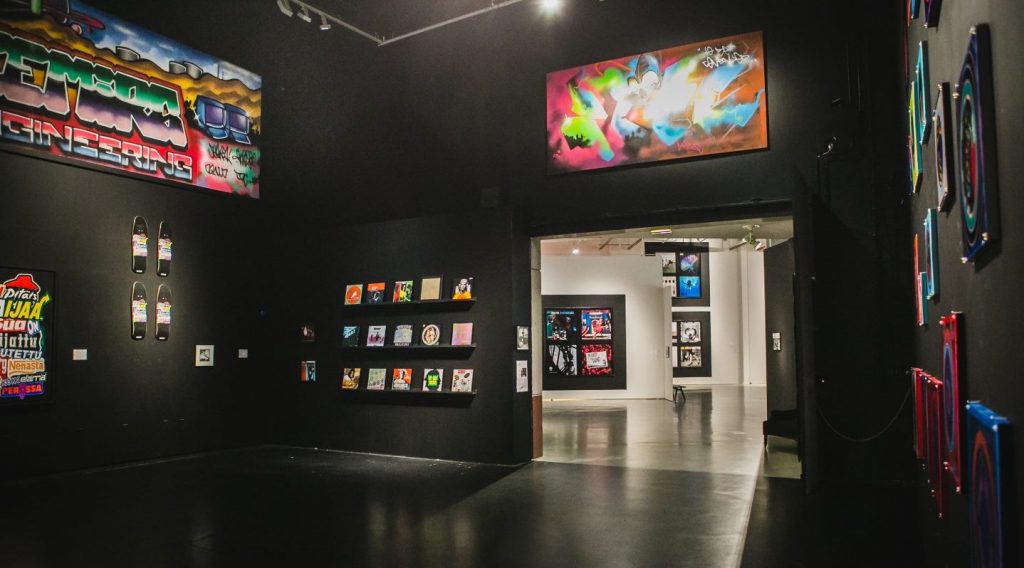
Not too long ago, the Vantaa art museum ARTSI honored cover art with its exhibition Cover Art – Living Vinyl! Very few exhibitions have blessed me with the same amount of joy and emotions as this one. The LP covers are direct reminders of our personal history, the earliest experiences going back to one’s juvenile years. Even the cognitive side was satisfied, people reporting to each other familiar and less familiar facts and stories about the displayed records, each according to his or her own level of knowledge.
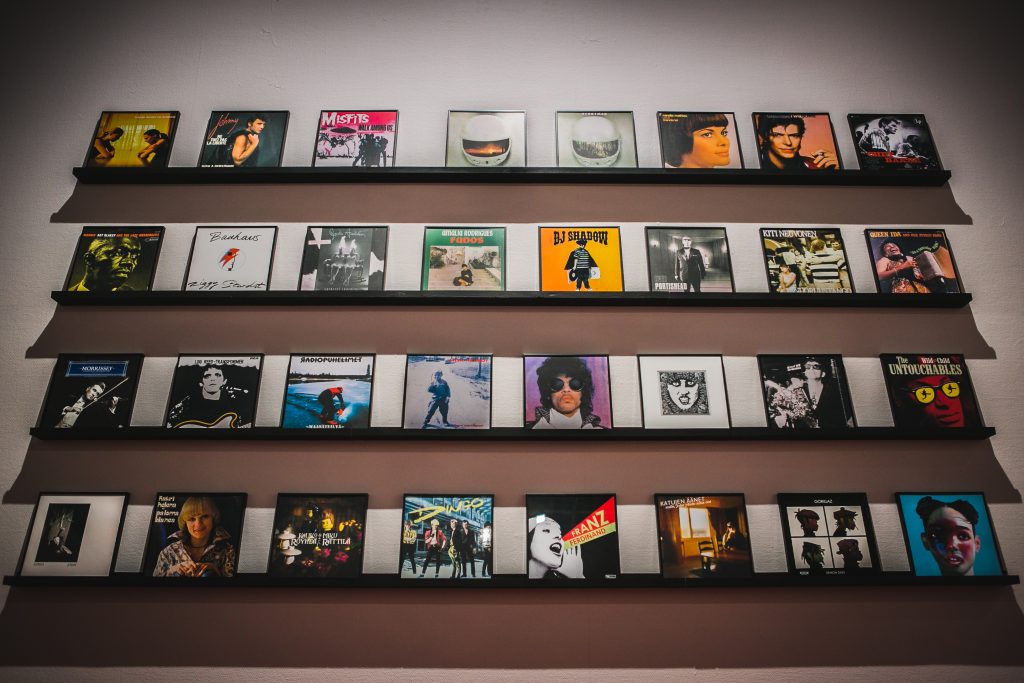
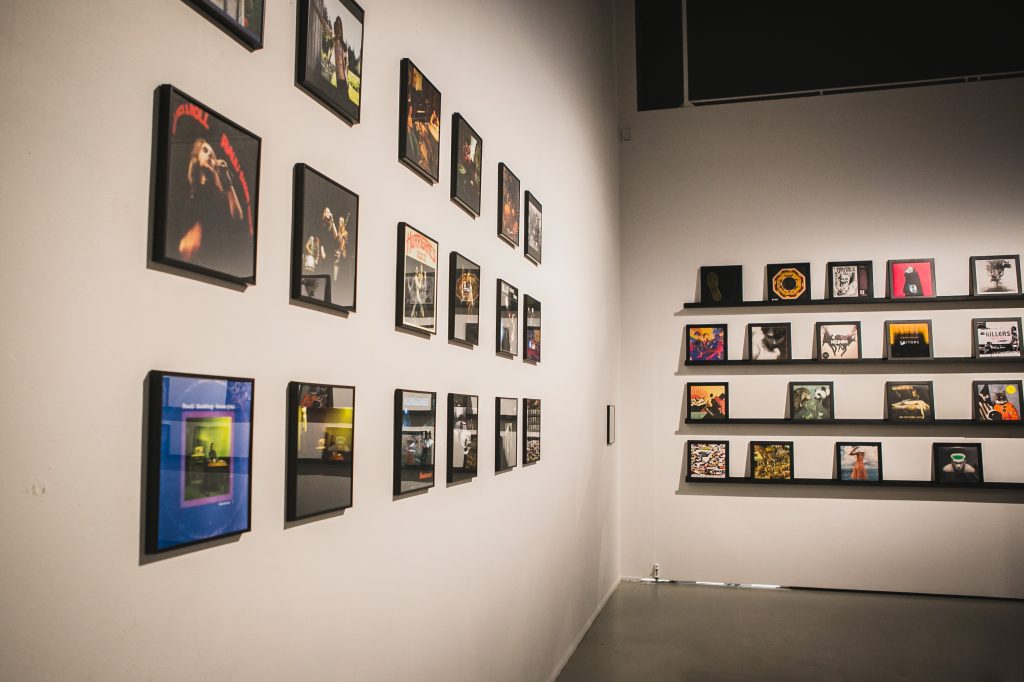
About 500 record covers, from several private collections, were hanging on the wall. Directly from London came dozens of LP covers from the famous “Best Art Vinyl” collection for 2005 – 2015.
Some of the covers were from the late 1940s, some from this decade. Inclusion of album covers from the 21st century gave the exhibition a special value. We learned, for example, that some subcultures deliberately embraced the vinyl format already early 2000s (even in the late 1990s), ie. much earlier than the existing vinyl boom, precisely because the format was abandoned by the dominant culture. The new flourishing period of the vinyls in the 2010s can be seen in the artistic quality of the latest LP covers.
The spacious presentation of the covers was exemplar. Densifications of covers added a pleasant rhythm for the large show area. Each theme had their own semi-concealed island.
The themes did not strictly follow any single music genre. The sociological perspective was also lacking. On purpose, I would say, because it was the album art – what is displayed on the cover – that was at the prime focus. Omissions were intentional. Finally an exhibition where the record cover is the star: of all the records, first was mentioned the cover designer, the illustrator, the graphic artist, the photographer, etc., and only then who’s playing and what, the record label/year and so on. A civilized gesture by the organizers.
The art of packaging
While admiring the artwork of the LP covers, one may miss that the cover with its inner sleeve have the practical purpose of protecting the record. Fundamentally cover art is art of packaging. Like all packages, the album cover provides selected information on its contents, eg. the list of songs on the rear side, etc.
But the image on the LP cover makes a more complex case. Naturally, the image too serves marketing goals, but on top of that it appears to have a higher symbolic role in presenting the contents (music) and often the social world of the musicians. The cover image escapes purely commercial explanations.
When LPs were the order of the day, the cover never was something “extra”. It had a value of its own, not perhaps equal to the music, but still very essential. Just think how many LPs have been bought just for their great immemorial cover photo!
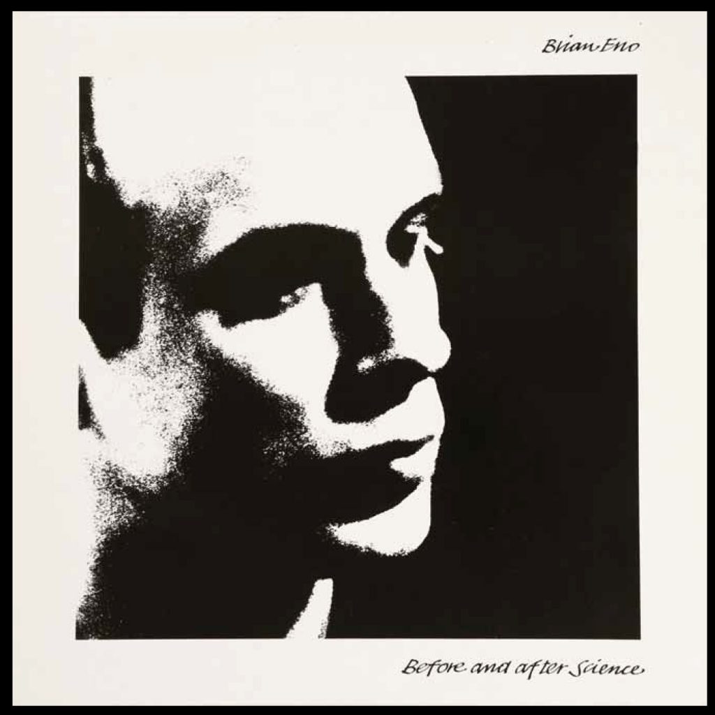
Above: Brian Eno intended to be a visual artist himself, and surely was able to designed the cover many of his albums such as this one. Photo by Ritva Saarikko.
Portraits
The most common artistic solution for the LP cover is, of course, to have an image of the artist or the artists (the band), a portrait of some sort. Especially in popular music and youth culture, the music is personified. Fans die to see how their favorite artists look like, at the same time nourishing the star cult.
If album art, to a great extent, is portrait art, photographers are its heroes. Surely there are dull covers, naiive covers, innocent and shady covers, unintentionally comical and artificially artistic covers, but also fabulous art photography, iconic era-changing implementations.
In some portraits, the musicians do not pose directly to the camera. Especially on some jazz labels the soloists and musicians are portrayed on duty at the club. And the portrait needs not always be a photograph. There are a number of memorable covers, in which the artist or the band is illustrated graphically by a drawing or painting.

Above: A good example of how cover art owes to cartoon art, folk art and street art. Sonic Youth’s LP is designed by Kevin Reagan and illustrated by Raymond Pettibon.
Various influences
The cover art as an art-form would not be of much interest if there had not been more ambitious artistic approaches to cover art starting from the 1960s. The Cover Art – Living Vinyl! exhibition deserved full points for the fact that the majority of the selected album covers belonged to this category.
There is no common denominator for the styles used. Some exude strong realism, others are dashing surrealist realizations, and there are covers that breath pure abstraction. Many of the covers have sought inspiration from pop art, collage techniques, animal symbolism, and so and so forth.

Above: This ambivalent cover is designed by Swiss surrealist Urs Amann.
More than anything cover art has drawn from comic art, graffiti and other forms of street art, something the ARTSI exhibition made very clear.
Above: Sometimes the cover image has no obvious connection to anything, which was intentional in this album cover of Pink (Hipgnosis design group).
Compared to poster art, cover art is graphically not as sophisticated and perfected. Album cover art has been documented in numerous books, particularly rock and jazz albums, but generally cover art lacks competitions, biennials and museums. It lives on the fringe of institutionalized art, and avoids canonization and too much aestheticization. There are certain similarities though, in particular regarding the rich use of typographic methods.

Above: Urs Fisher, known for its art world questioning installations and sculptures, has designed this cover for the American indie-rock band Yeah, Yeah, Yeahs.
Professionals on the matter
Another thing is that the artists behind the album covers aren’t always professionals. Numerous great album covers have been designed by amateurs. Even the musicians themselves design and shoot the covers for themselves or for other musicians, the most famous case being the recent Nobel Prize winner Bob Dylan, but also Brian Eno and many others.
But it’s also true that, since the late 1940s, album cover art attracted numerous world-class artists, painters, graphic designers and photographers. The list of artists, graphic artists, sculptors behind the covers displayed at the Cover Art exhibition was breath-taking: Diane Arbus, Urs Amann, Annie Leibowiz, Damien Hirst, Peter Peter Blake, Peter Saville, Banksy, Robert Del Naja aka 3D, Scott Caris, Brian Duffy, Futura 2000, HR Gigs, Pierre & Gilles, Urs Fisher, Richard Hamilton, Paul Insect, Ryan Johnson, Kacper Kasprzyk, Nick Knight, Michael Lavine, Stuart Murdoch, Helmut Newton, Robert Rauschenberg, Gerhard Richter, Bettina Rheims, Emil Schult, Trung, Lesley Unruh, Gee Vaucher, Xavier Veihan, Andy Warhol and Michael Whelan. Huh!
Really hot names all! Well-known surrealists, neo-dadaists, pop artists, poster artists, sculptors, and so on. Leibowitz, Duffy, Giger, Hamilton, Hirst, Newman, Rauschenberg, and Warhol together in one and the same exhibition! Does not happen very often. In this respect the exhibition gave a rare opportunity to see and contemplate, in a new light, the whole production and development of these artists.
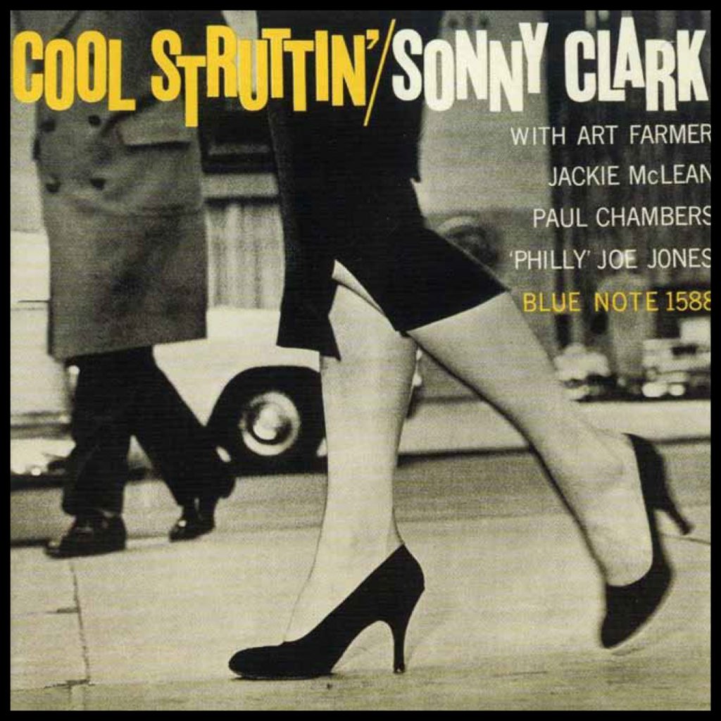
Inner style
My favourite section was the one devoted to jazz, samba, flamenco, bossa nova, dubstep, hip hop and latin. Jazz covers especially. So sensual, so stylish … as on this Blue Note album of Sonny Clark.
Or the abstract imagery of the Miles Davis Quintet album from 1958 by Esmond Edwards.

The below No Line on the Horizon is the studio album by U2, and the ultra-simplistic cover art is a photograph of Lake Constance, taken by Japanese photographer Hiroshi Sugimoto.

A bit of criticism
There’s room for criticism when it comes to cover art literature, exhibitions etc. First off, the blaming finger would point to the fact that the sample albums mostly originate from the English speaking world. Fantastic, absolutely high quality cover art is being made in all language areas but those albums are rarely covered by exhibitions and the like. The ARTSI exhibition did an admirable work in displaying quite a many domestic (Finnish) vinyl covers from the 1940s onwards. The below case represents Finnish realism at its best: ice-cutting with a chain saw. Cover design: J.A. Map, photo Esko Männikkö.

The same is true of albums of classical music. Those covers exhibit first-class cover art by many famous painters and artists, and yet majority of the covers highlighted in different media represent pop & rock.
Finally, some enthusiasts might suspect the whole idea of such exhibitions etc. Many of the albums displayed were, in their heyday, in one way or another against the dominant culture with its cultural institutions such art museums. Here they are framed with IKEA picture frames, and hanged on the wall under the beam of the spotlights, horizontally slightly above the eye-level. Would this be a typical case for the dominant culture making something (eg. punk) harmless by appropriation and canonization? I don’t have the answer. Isn’t punk in any of its forms already mainstream, so that no faux pas is taking place? On the other hand, it does feel a bit strange to see the Never mind the bollocks spotted on the wall of a stylish art museum. Cover Jamie Reid.

The punk department (hardcore, drum and bass, downtempo, leftfield ja metal) of the exhibition with all the rarities was thoughtfully executed.
Photos of the exhibition: Sami Seppänen. All cover pics are from the related 240 p. book COVER ART – Living vinyl!